Top 17+ XAT Special Charts Questions with Solutions PDF
XAT Special Charts questions stand out for their unconventional and complex presentation of data, often going beyond standard chart types like bar graphs or pie charts. These may include spider charts, bubble charts, heat maps, or hybrid formats combining multiple data representations. Such questions test a candidate's adaptability, analytical thinking, and ability to synthesize information from unfamiliar formats. To check similar important topics, checking with the XAT syllabus will help you understand better and plan your preparation accordingly.
Along with this, we recommend you to solve questions from XAT previous papers. This will help you in knowing the question types and various type of questions being asked in the actual exam. We've compiled all the questions with detailed solutions from previous exams to help you with your preparation. You could download them as PDF and solve them as per your convenience.
XAT 2025 Special Charts questions
Read the following scenario and answer the THREE questions that follow.
Comprehension:
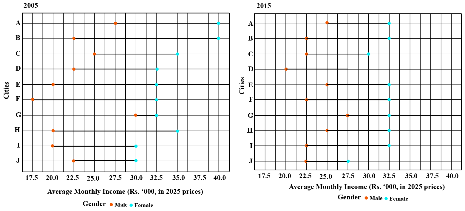
The plots below depict and compare the average monthly incomes (in Rs. ’000) of males and females in ten cities of India in the years 2005 and 2015. The ten cities, marked A-J in the records, are of different population sizes. For a fair comparison, to adjust for inflation, incomes for both the periods are scaled to 2025 prices.
Each red dot represents the average monthly income of females in a particular city in a particular year, while each blue dot represents the average monthly income of males in a particular city in a particular year. The gender gap for a city, for a particular year, is defined as the absolute value of the average monthly income of males, minus the average monthly income of females, in that year.

Question 1
In which city did the gender gap, in terms of 2025 prices, change the least, from 2005 to 2015, in terms of percentage?
correct answer:-2
Instruction for set 1:
Read the following scenario and answer the THREE questions that follow.
Comprehension:
The plots below depict and compare the average monthly incomes (in Rs. ’000) of males and females in ten cities of India in the years 2005 and 2015. The ten cities, marked A-J in the records, are of different population sizes. For a fair comparison, to adjust for inflation, incomes for both the periods are scaled to 2025 prices.
Each red dot represents the average monthly income of females in a particular city in a particular year, while each blue dot represents the average monthly income of males in a particular city in a particular year. The gender gap for a city, for a particular year, is defined as the absolute value of the average monthly income of males, minus the average monthly income of females, in that year.

Question 2
Which of the following statements, about the average monthly incomes of the 10 cities, as represented in the plots, is DEFINITELY FALSE?
correct answer:-3
Instruction for set 1:
Read the following scenario and answer the THREE questions that follow.
Comprehension:
The plots below depict and compare the average monthly incomes (in Rs. ’000) of males and females in ten cities of India in the years 2005 and 2015. The ten cities, marked A-J in the records, are of different population sizes. For a fair comparison, to adjust for inflation, incomes for both the periods are scaled to 2025 prices.
Each red dot represents the average monthly income of females in a particular city in a particular year, while each blue dot represents the average monthly income of males in a particular city in a particular year. The gender gap for a city, for a particular year, is defined as the absolute value of the average monthly income of males, minus the average monthly income of females, in that year.

Question 3
Rs.100 in 2025 is worth Rs. 60 in 2015 prices, and Rs. 25 in 2005 prices. Based on the given plots, which of the following statements, about the unscaled incomes, i.e., the incomes before scaling to 2025 prices, CANNOT be correct? (All statements refer to people represented in the given plots.)
correct answer:-5
XAT 2023 Special Charts questions
Go through the information given below, and answer the THREE questions that follow.Comprehension:The three graphs below capture relationship between economic (and social) activities and subjective well-being. The first graph (Graph-1) captures relationship between GDP (percapita) and Satisfaction with life, across different countries and four islands: Gizo, Roviana, Niijhum Dwip, and Chittagong. The Graph-2 captures three different measures of subjective well-being (Satisfaction with life, Affect Balance and Momentary Affect) across the four islands, which have different levels monetization (Index). The Graph-3 captures levels of thirteen different socio-economic activities across four islands.


Question 1
Which of the following will BEST capture the relationship between GDP (x-axis) and Life Satisfaction (y-axis) of countries?
correct answer:-3
Instruction for set 1:
Go through the information given below, and answer the THREE questions that follow.Comprehension:The three graphs below capture relationship between economic (and social) activities and subjective well-being. The first graph (Graph-1) captures relationship between GDP (percapita) and Satisfaction with life, across different countries and four islands: Gizo, Roviana, Niijhum Dwip, and Chittagong. The Graph-2 captures three different measures of subjective well-being (Satisfaction with life, Affect Balance and Momentary Affect) across the four islands, which have different levels monetization (Index). The Graph-3 captures levels of thirteen different socio-economic activities across four islands.


Question 2
Which of the following, about the four islands, can be BEST inferred from the graphs?
correct answer:-5
Instruction for set 1:
Go through the information given below, and answer the THREE questions that follow.Comprehension:The three graphs below capture relationship between economic (and social) activities and subjective well-being. The first graph (Graph-1) captures relationship between GDP (percapita) and Satisfaction with life, across different countries and four islands: Gizo, Roviana, Niijhum Dwip, and Chittagong. The Graph-2 captures three different measures of subjective well-being (Satisfaction with life, Affect Balance and Momentary Affect) across the four islands, which have different levels monetization (Index). The Graph-3 captures levels of thirteen different socio-economic activities across four islands.


Question 3
Which of the following site has the highest fishing to economic ratio?
correct answer:-3
XAT 2017 Special Charts questions
The grid below captures relationships among seven personality dimensions: "extraversion", "true_arousal_plac", "true_arousal_caff”, "arousal_plac", "arousal_caff”, "performance_plac", and "performance caff”. The diagonal represents histograms of the seven dimensions. Left of the diagonal represents scatterplots between the dimensions while the right of the diagonal represents quantitative relationships between the dimensions. The lines in the scatterplots are closest approximation of the points. The value of the relationships to the right of the diagonal can vary from -1 to +1, with -1 being the extreme linear negative relation and +1 extreme linear positive relation. (Axes of the graph are conventionally drawn).

Question 1
Which of the following is true?
correct answer:-1
Instruction for set 1:
The grid below captures relationships among seven personality dimensions: "extraversion", "true_arousal_plac", "true_arousal_caff”, "arousal_plac", "arousal_caff”, "performance_plac", and "performance caff”. The diagonal represents histograms of the seven dimensions. Left of the diagonal represents scatterplots between the dimensions while the right of the diagonal represents quantitative relationships between the dimensions. The lines in the scatterplots are closest approximation of the points. The value of the relationships to the right of the diagonal can vary from -1 to +1, with -1 being the extreme linear negative relation and +1 extreme linear positive relation. (Axes of the graph are conventionally drawn).

Question 2
Which of the scatterplots shows the weakest relationship?
correct answer:-1
Instruction for set 1:
The grid below captures relationships among seven personality dimensions: "extraversion", "true_arousal_plac", "true_arousal_caff”, "arousal_plac", "arousal_caff”, "performance_plac", and "performance caff”. The diagonal represents histograms of the seven dimensions. Left of the diagonal represents scatterplots between the dimensions while the right of the diagonal represents quantitative relationships between the dimensions. The lines in the scatterplots are closest approximation of the points. The value of the relationships to the right of the diagonal can vary from -1 to +1, with -1 being the extreme linear negative relation and +1 extreme linear positive relation. (Axes of the graph are conventionally drawn).

Question 3
In which of the following scatterplots, the value of one dimension can be used to predict the value of another, as accurately as possible?
correct answer:-3
Instruction for set 1:
The grid below captures relationships among seven personality dimensions: "extraversion", "true_arousal_plac", "true_arousal_caff”, "arousal_plac", "arousal_caff”, "performance_plac", and "performance caff”. The diagonal represents histograms of the seven dimensions. Left of the diagonal represents scatterplots between the dimensions while the right of the diagonal represents quantitative relationships between the dimensions. The lines in the scatterplots are closest approximation of the points. The value of the relationships to the right of the diagonal can vary from -1 to +1, with -1 being the extreme linear negative relation and +1 extreme linear positive relation. (Axes of the graph are conventionally drawn).

Question 4
Which of the following options is correct?
correct answer:-2
XAT 2015 Special Charts questions
Answer the questions on the basis of information given below.
As a part of employee improvement programs, every year an organization conducts a survey on three factors: 1. Number of days (in integers) of training undergone, 2. Amount of bonus (in lacs) received by an employee and 3. Employee effectiveness score (on the scale of 1 to 10). Survey results for last two years are given below for the same seven employees.


Question 1
In Survey 1, what was the average bonus earned by employees who underwent training for more than 17 days?
correct answer:-4
Instruction for set 1:
Answer the questions on the basis of information given below.
As a part of employee improvement programs, every year an organization conducts a survey on three factors: 1. Number of days (in integers) of training undergone, 2. Amount of bonus (in lacs) received by an employee and 3. Employee effectiveness score (on the scale of 1 to 10). Survey results for last two years are given below for the same seven employees.


Question 2
Identify the number of employees whose employee effectiveness score was higher than 7 in Survey 1, but whose bonus was lower than 20 lacs in Survey 2.
correct answer:-1
Instruction for set 1:
Answer the questions on the basis of information given below.
As a part of employee improvement programs, every year an organization conducts a survey on three factors: 1. Number of days (in integers) of training undergone, 2. Amount of bonus (in lacs) received by an employee and 3. Employee effectiveness score (on the scale of 1 to 10). Survey results for last two years are given below for the same seven employees.


Question 3
From Survey 1 to Survey 2, how many employees underwent more days of training but their annual bonus decreased?
correct answer:-2
Instruction for set 1:
Answer the questions on the basis of information given below.
As a part of employee improvement programs, every year an organization conducts a survey on three factors: 1. Number of days (in integers) of training undergone, 2. Amount of bonus (in lacs) received by an employee and 3. Employee effectiveness score (on the scale of 1 to 10). Survey results for last two years are given below for the same seven employees.


Question 4
From Survey 1 to Survey 2: for how many employees training days increased along with an increase of employee effective score by at least 1.0 rating?
correct answer:-1
XAT 2014 Special Charts questions
Answer the questions based on the trends lines from the following graphs.
Note: Left side of X axis represents countries that are “poor” and right side of X axis represents countries that are “rich”, for each region. GDP is based on purchasing power parity (PPP).
These are World Bank (WB) estimates.

Question 1
Which of the following could be the correct ascending order of democratic regions for poor?
correct answer:-4
Instruction for set 1:
Answer the questions based on the trends lines from the following graphs.
Note: Left side of X axis represents countries that are “poor” and right side of X axis represents countries that are “rich”, for each region. GDP is based on purchasing power parity (PPP).
These are World Bank (WB) estimates.

Question 2
Which region has the highest disparity, of democratic participation, between rich and poor?
correct answer:-2
Instruction for set 1:
Answer the questions based on the trends lines from the following graphs.
Note: Left side of X axis represents countries that are “poor” and right side of X axis represents countries that are “rich”, for each region. GDP is based on purchasing power parity (PPP).
These are World Bank (WB) estimates.

Question 3
The maximum GDP of African region is higher than the maximum GDP of South American region by factor of:
correct answer:-5
XAT 2013 Special Charts questions
Analyze the railway train chart below:

Question 1
Which is the fastest train between HHH and NNN?
correct answer:-4
Instruction for set 1:
Analyze the railway train chart below:

Question 2
Which is the fastest train between AAA and NNN?
correct answer:-1
Instruction for set 1:
Analyze the railway train chart below:

Question 3
If you have to travel from AAA and reach HHH at around 9:00 AM, and then further travel to NNN at around 6:00 PM, which is the best combination of trains for you?
correct answer:-4

